
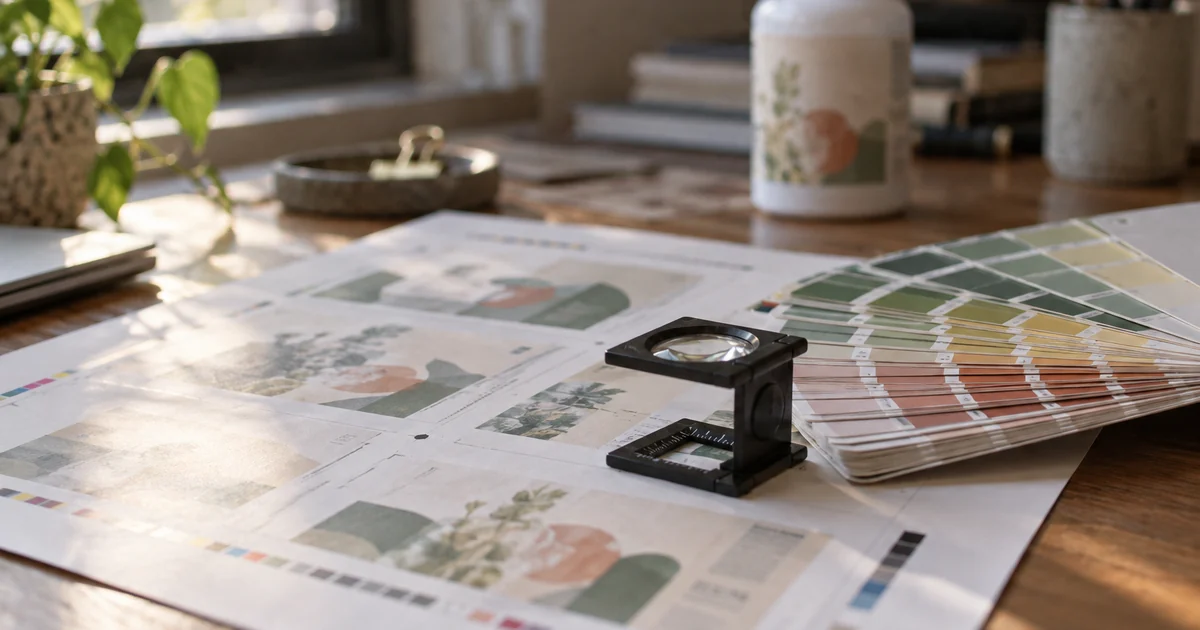
When a launch slips, everyone blames production. In our experience the delay usually sits earlier: artwork that cannot print, a barcode that belongs to someone else, a dieline nobody asked for, or a Supplement Facts panel that was treated as a design decision.
None of it is hard. All of it has to be done in the right order.
Barcodes first, because they gate everything
| Code | Digits | Where it goes | Who issues it |
|---|---|---|---|
| UPC-A | 12 | US retail unit | GS1 US company prefix |
| EAN-13 | 13 | EU and most international retail units | GS1 member organisation |
| GTIN-14 | 14 | Shipping case | Derived from your prefix |
| FNSKU | Alphanumeric | Amazon unit label | Amazon, assigned to your listing |
Three rules that catch people:
- A GTIN is per sellable unit, not per product. A 60 count and a 120 count need different numbers, even with identical contents. The retailer's system treats them as separate items.
- Buy the prefix from GS1, not from a reseller. Marketplace and retail compliance checks are increasingly strict about whether the brand owns the GTIN. A cheap resold barcode is a launch that gets blocked after the labels are printed.
- Never print the barcode as an image from a screenshot. It must be vector, or a high resolution raster printed at 100 percent magnification, with the quiet zone intact. A barcode that scans in your office and fails in a warehouse is a returned pallet.
For marketplace sales, the unit carries a UPC and Amazon applies an FNSKU label over it, or you print the FNSKU directly. Printing both into the artwork is possible and reduces a handling step, but it means every revision touches the barcode area, so keep it in its own layer.
The dieline is not optional
A dieline is the flat template of the label or carton, with the cut lines, fold lines and bleed marked. Get it from the factory, for the exact bottle or jar you are using, before design starts. Not a similar bottle. The exact one.
Two failures follow from skipping this:
- The label does not fit the container. A 2 mm difference in diameter is a visible overlap or a gap at the seam.
- The design was made for a different container. A bottle change after artwork approval means redoing the dieline, the layout and often the print plates.
If you are choosing a stock bottle to save tooling cost, choose it before the designer opens the file. Our packaging cost breakdown explains where the tooling money actually goes, and our Amazon launch guide explains why the container dimensions affect your fees before they affect your looks.
The print file, precisely
Give the printer this and nothing else:
| Item | Requirement |
|---|---|
| Format | Vector PDF, or the native file with fonts embedded and outlined |
| Colour | CMYK for process, plus named spot colours if used |
| Resolution | 300 dpi at final size for any raster element |
| Bleed | 3 mm minimum beyond the trim |
| Safe area | Keep text and barcodes inside the margin the dieline specifies |
| Barcodes | Vector, black on white, quiet zone clear of graphics |
| Layers | Dieline on its own layer, marked as non printing |
| Text | Real text, not outlined, unless the printer asks otherwise |
The last line is a real trade-off. Outlining fonts guarantees the file renders correctly, but it removes the printer's ability to fix a typo or adjust spacing. Real text with embedded fonts is better if the relationship is good, and outlined is safer if it is not.
Print method changes what you can design
| Method | Best for | Watch out for |
|---|---|---|
| Digital | Short runs, frequent revisions | Cost per unit stays high at volume |
| Offset | Long runs, tight colour control | Plate cost per revision |
| Flexo | Roll fed labels at volume | Colour drifts more than offset |
| Screen | Bold colours, white on clear | Coarse detail |
Two consequences worth knowing before you design:
- Clear labels need white ink. Without a white base layer, the label is transparent and the powder colour shows through the text area. That is an extra print station and an extra cost.
- Kraft and coloured stock shift every colour. Your brand blue on white becomes a different blue on kraft. Proof on the actual substrate, not on screen.
Never approve colour from a monitor. Approve from a physical proof, ideally on the production substrate, under the light the product will be seen in.
The Supplement Facts panel is not a design element
The panel has format requirements: the order of the nutrients, the type sizes relative to each other, the required footnotes, and the serving size declaration. A designer who adjusts the typography for aesthetics can break the compliance of the whole label.
Treat the panel as fixed content supplied by whoever is responsible for regulatory review, then design around it. Put it in the layout early, because it is usually the largest single block on the back panel and it constrains everything else.
The same principle applies to the ingredient statement, allergen declarations, the structure or function disclaimer, and any market specific warnings. These are text blocks with rules, not copy to be reworded.
The panel changes by market
One artwork rarely serves every market, and the differences are structural, not cosmetic:
| Market | What the panel needs that others do not |
|---|---|
| United States | Supplement Facts panel with the structure or function disclaimer |
| European Union | Nutrition declaration in the EU format, allergens emphasised in the ingredient list |
| United Kingdom | Same model as the EU, with separate national registration rules |
| Canada | A licence number on the label before sale |
| Australia | An AUST L number for listed medicines |
The practical consequence: budget for a second or third artwork version if you sell in more than one market, and design the layout with room for a longer ingredient statement. A back panel built to the US layout rarely has space for an EU nutrition declaration added later without shrinking the type.
Ask your regulatory reviewer which markets the label must satisfy before the designer starts. It is the cheapest conversation in the whole project.
Who owns the artwork and the plates
Settle this in writing before production:
- The brand should own the final artwork files, in an editable format.
- The print plates or cylinders belong to whoever paid for them. If you paid, ask for them or ask for a credit if you move.
- Going to a second printer with the same PDF is normal and should not require permission from the factory.
If a factory will not release the artwork file you paid for, that is a commercial constraint you will feel at the worst possible moment: when you need to switch suppliers quickly.
Version control, or how labels become waste
Every artwork needs a revision code printed in the file name and, ideally, in a small line on the label. Then:
- One person approves, in writing, with the revision code named.
- The printer confirms which revision they are printing.
- Leftover labels from the previous revision are destroyed or clearly quarantined, not used to finish a run.
Over-ordering labels to save a print setup is a false economy if a claim changes next quarter. Under-ordering stops the line for two weeks. Most brands settle on a buffer of one production run, not a year of supply.
Ten point pre press checklist
- Dieline matches the exact container, current version.
- Net quantity, in the units the market requires.
- Barcode is owned by the brand, correct symbology, correct size, quiet zone clear.
- Supplement Facts panel supplied by regulatory, not edited in design.
- Ingredient list matches the approved formula, including the carrier and the capsule.
- Allergen statement present and consistent with the ingredient list.
- Lot and expiry fields exist, in the right place, with enough space to print.
- Country of origin, if the market requires it.
- Spot colours named, and the proof approved on substrate.
- Revision code on file and in the approval email.
Frequently asked questions
Can I use the same barcode for a capsule and a gummy in the same line?
No. Different sellable unit means a different GTIN, even if the brand and the name are the same.
Do I need an EAN if I only sell in the US?
A UPC-A is sufficient for US retail. If you plan to sell in the EU or through international marketplaces, plan the EAN from the start so the label does not need reprinting.
Who provides the dieline?
The factory, for the specific container. If a factory cannot provide one, that is a warning about how they handle packaging.
Can the factory design my label?
Some do, at a basic level. Brand design is usually better done by a designer, with the factory reviewing print feasibility and the regulatory blocks.
How long does artwork take?
Two to four weeks for a new label including proofing, longer if the Supplement Facts panel needs regulatory review, and it is almost always the longest item on the critical path before production.
The takeaway
Artwork is engineering. Get the barcode from GS1, the dieline from the factory, the panel from regulatory, and approve colour on paper. Then the label prints once, correctly, and the launch date holds.
Send us the container you intend to use and we will send the dieline, the label size options and the print specifications before you commission any design work. If you are starting from our private label range, the dielines for every stock container are already on file.